

Art Basel 2025 Review
- visualvokeart
- Apr 5, 2025
- 7 min read

Art Basel is an internationally acclaimed art fair that stages the world's most premier modern and contemporary pieces. Spanning three flagship editions—Basel, Miami Beach, and Hong Kong—the event transcends its commercial origins to serve as a dynamic platform for cultural exchange and artistic innovation. This year, our team paid a visit to Art Basel Hong Kong in hopes of exploring the modern and contemporary novelties that shape today's art scene.
A Commentary by Matthias Find:

One of my favourite artworks I saw at Art Basel was Untitled by American artist Franz Kline. Commonly associated with the Abstract Expressionism movement of the 1940s and artists such as Jackson Pollock and Wilem de Kooning, who was his good friend and creative influence. Having been originally trained in illustration and landscape drawings, his personal style of gestural abstraction–including board brush strokes–and using large-scale compositions originated from his time spent in New York, where de Kooning first suggested to Kline to try out gestural abstraction rather than the realist works he had been doing previously. Over time, Kline’s style evolved drastically, with his line work becoming more fluid and non-representative, and his constant use of a monochrome palette gave him the nickname the ‘black and white artist.'
The piece is largely made up of broad, sweeping brush strokes of green and blue, which are occasionally broken up by patches of painted fabric and refuse phone book pages, a recurring symbol in his work. These pages are painted yellow, which provides a stark contrast to the cool colours that dominate the composition and highlights the two pages as the main focal points of the piece. The imbalanced brush strokes of the piece also create a sense of dynamic movement throughout the piece, embedding the piece with a vibrant yet chaotic energy, giving the impression that the painting cannot sit still. This restless energy is why I enjoy this piece so much, as it feels as if the artist behind the work created it in a flash of inspiration and poured his energy into the piece itself.
To me, Untitled, combines the bountiful energy of youth with the idea of endless opportunities that can come as a result of this energy and hope. In a similar manner to how Sylvia Plath describes the opportunities she has in life, “I saw my life branching out before me like the green fig tree in the story. From the tip of every branch, like a fat purple fig, a wonderful future beckoned and winked.” I was particularly captivated by this stylized, abstract approach that is executed in loose, gestural brushstrokes. Lines or forms radiating with symbols or motifs embodied a sense of whimsicality that I resonate a lot with in my own works. The amorphous forms of various hues from bright, young colours to deeper shades, coupled with the fragmented materiality of the surface also reminded me of Antoni Tàpies’ detaching of the contextual from the visual. With respect to its phenomenological exterior, I began to observe the piece purely visually, isolating qualia from cognitive rationalisation. Could the deliberate distortion of symbols and motifs, the jarring juxtaposition of colours be a testament to an introspective visual experience, steering away from the typical context-locked approaches of modern artists? This remains a question to be answered.
A Commentary by Evan Lai:

The artwork I liked the most was Unnatural breath VI by Chinese artist Shi Chong. Shi exhibited his solo project Hermit: Shi Chong at Art Basel, incorporating a diverse use of oil paints, pencil sketches and watercolour. Shi explains in his rationale his goal is to ‘repeatedly extract and refine the symbols and metaphors attached to the body, forming a hybrid, subtle, and ambiguous relationship between time, space and the body’. He further aims to highlight the most prominent contours of the human form in a filter of obscurity, embedding a dust-like quality on his work that allows the key forms to shine through.
Unnatural breath VI depicts five separate panels of a nude with rough ambiguous borders, seemingly in contorted and agonised forms. Shi utilises a minimalist colour palette of dark mauve and peach, blurring the subject in a way that evokes the style of pointillism. The smudged frames embody a sense of organicity, and the subtle splotches of white paint over the painting create an illusion that the form is seen through a blurry, transparent material. The technical conviction of Shi goes on full display here in a stunning portrayal of raw anatomy, while not compromising on the conceptual depth of his work, which succeeds at illustrating the human form through dusty obscurity.
I was most intrigued by the technical diversity employed in Shi’s work. The blurriness and layering of paints, combined with the interplay of light and shadow, creates a moving and owing piece that fleshes out the multifaceted essence of human emotion. Notably, the ephemeral and somewhat surreal visuals the artist creates really evoked a strong sense of metaphysical and cerebral intangibility. The unseen dimensions of human experience reminded me of the notion of ‘flow state’ in psychology. Like fragments of a half-remembered dream, I see the haziness of form as a strategic ambiguity not to obscure meaning, but to amplify it, visualizing the fleeting and elusive nature of the flow state where time and self-consciousness dissolve. I think it is the fluid coalescence of these elements, turning a static image into a kinetic, emotional journey, that Shi’s work transcends the physical, nudging viewers toward a metaphysical contemplation of what lies beneath conscious thought.
A Commentary by Eugene Lau:


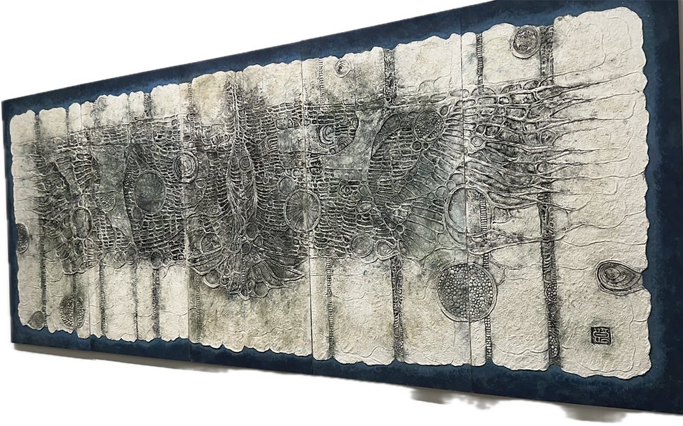
Among the opulence of conceptual masterpieces at the exhibitions, the work that stood out to me the most was Shimomura Ryōnosuke’s tactile approach to nihonga (Japanese-style painting). Immediately, an expansive winged creature dominates the space in front of you, demanding attention. Taking a closer look, an intricate textural manipulation of papier-mâché, in a skeletal and almost cellular arrangement, takes form, imbuing the piece with an eerie poeticism. Upon research, I found out that Ryōnosuke, born in Osaka, was the co-founder of the Pan-real Art association in 1948, who propelled the avant-garde movement of revolutionising nihonga, which they deemed short of breath. Experiencing post-war societal repercussions, Ryōnosuke transformed the often ethereal and elegant nihonga representations of nature into sociopolitical subjects. Infusing his personal graphic stylisation with an underlying geometric construction inherited from Cubist influences, he depicts a bird that slashes through the sky as though it were taking charge.
Upon closer inspection, the paperwork is densely creased and textured with a coarse optical pattern, fusing traditional ink application with novel expression. Ryōnosuke developed a technique based on paper pulp that allowed him to work on both the drawing and the relief. The compositions of his large-scale works are mostly symmetrical, employing the widespread quality of wings to impose an enveloping effect on viewers. The choice of subject, birds, formed by a blend of geometric grids and organically skeletal protrusions, alludes to the Japanese folklore of Yōkai (mysterious apparitions), painting a mystical atmosphere which pays tribute to a deathly, melancholic post-war society.
I was extremely impressed by Ryōnosuke’s fusion of tactile innovation and sociopolitical depth in his avian nihonga series. His use of papier-mâché’s textural dynamism which merges skeletal geometry and organic forms truly pushes traditional mediums into sculptural realms, blending drawing and relief. This interplay between Cubist rigidity and folklore mysticism in the context of his bird—a symbol of post-war turbulence—has also led me to ponder upon the recurring motif of birds in his body of work as a cultural narrative: The chronology of display suggests a journey from a curvilinear construction in bright blue, to gradually darkened and more skeletal forms, and finally to the largest display of fossilised decay. Could this be a hint at the deterioration of self and post-war rebellion?
A Commentary by Emily Wong:


'Old Landscape' is a series of acrylic and ink paintings by the Hong Kong artist Yuk-Keung Kurt Chan.
The first looks of paintings are abstractly drawn patterns of nature. Roots and tree branches expand across the canvas like veins, overlapping patterns of lightning and tangling crystals and rocks. The brushwork depicting the texture of the trunk and rocks reminds me of traditional Chinese ink painting. Whereas the large and strong extending movement of branches creates dramatic tension that is less common in Chinese ink landscape paintings, leaving a lasting visual impact. The sharp, vibrant use of pink and green also suggests a unique spirit of nature.
During my visit, I learned more about the work through the artist. The artist said he would call the rock sculpture in the centre of the paintings, 'Sophia', who was addressed like a living being. The artist also stated that he created the series as if through the eyes of 'Sophia'. From my understanding, 'Sophia' refers to the humanoid robot 'Sophia' that was activated in 2016, known for its ability to mimic social behaviours and induce feelings of love. The artist also stated, rock, refers to inorganic elements could possibly be an origin of life, other than life from water. Looking more into the work, the rock sculpture is a representation of the artist drawing inspiration from the Miller-Urey Experiment.
The Miller-Urey Experiment was performed by Standley L. Miller and Harold C. Urey in 1953 to test whether organic molecules could be formed from chemical reactions between inorganic molecules. Inside the flasks of the experiment were water, ammonia, hydrogen and methane gases to mimic early Earth atmospheric conditions, with boiling water as a form of energy. They later added electrodes to stimulate lightning. Amino acids were formed which demonstrated a chemical evolution that supports hypotheses about the origins of life. The three fundamental elements that make life possible are electricity, water, and minerals; where the artist painted lightning, water and crystals as his fundamental subject matter.
This unique perspective reinterprets rocks, trees and water in a scientific way, which is an interesting dynamic play between science and traditional Chinese ink art elements. This inspired me, as a student, to attempt modern art by bringing different elements and dynamics together, in creating intriguing philosophies in addressing the wonders of this world and the existence of life.
Other References: https://www.momak.go.jp/English/exhibitionArchive/2008/366.html


Comments