

Fernando Zóbel: Order is Essential
- Eugene Lau
- Jul 25, 2025
- 5 min read
Multicoloured splatters of paint adorn sprawling canvases; a sight often seen on social media by experimental amateurs, or showcased in prestigious art galleries with multi-million dollar price tags. But what separates the two? The thought, the technique, or the artist’s fame? “Order is essential” explores the evolution of modern artist Fernando Zóbel, whose practice transcended mere aesthetics to capture the essence of experience. Incorporating the abstract conception of painting into the act itself, Zóbel developed his observations of nature beyond pretext to theme, inviting us to find a sense of order through the formal qualities of his art.

Born to an industrialist father and an aristocratic mother, Fernando Zóbel (1924-1984) was a self-taught Spanish painter who grew up in Manila and Madrid. In 1946, he attended Harvard University to study history and literature, and while his work there focused on the Spanish poet and playwright Federico García Lorca, he was active in university social life, indulging in print-making, drawing caricatures and murals, and working with the librarians. He was associated with the same circles as the Boston artists, such as Jim Pfeufer, Reed Champion, Jack Levine, as well as poets Delmore Schwartz and Stephen Spender.
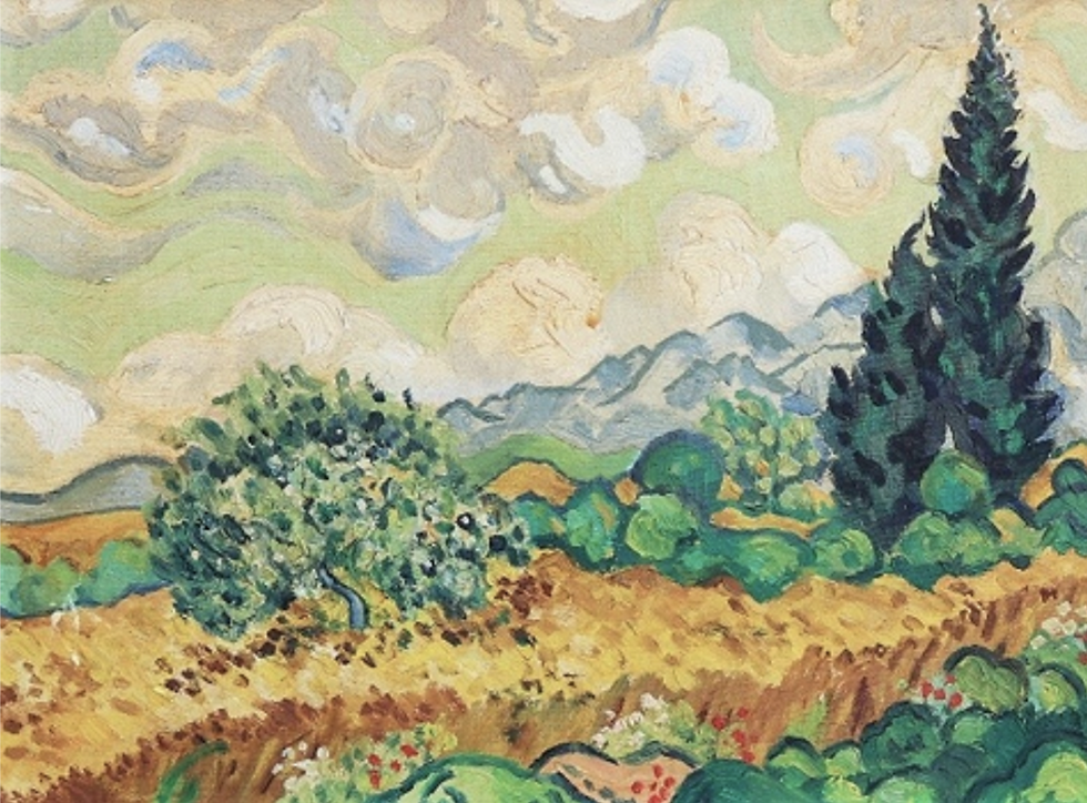
Enthralled by art history, Zóbel was propelled to study and recreate works of the preceding time, notably Vincent van Gogh’s 1889 work A Wheatfield of Cypresses, where he was drawn to the vitality of vivid colours and lively brushstrokes.
His incipient effort in responding to the expressionist style marked his conversation with the timelessness of the artistic moment. In one of his sketchbooks, he quoted art historian George Kubler, a theorist on the “shape” of time: “The precursor shapes a new civilisation; the rebel defines the edges of a disintegrating one.” Could this signify his embodiment of both the roles of shaping the new and the edges of a vanishing present? His subsequent body of work answers this.
In 1954, Zóbel enrolled in the Rhode Island Design School, where an exhibition he saw there completely changed his approach to art. It was Mark Rothko’s multiform painting.

At first glance, you see large patches of solid colour seemingly devoid of figurative or symbolic references. Some might consider it an ostentatious display of minimalism or a message so conceptually underwhelming, but you slowly start to appreciate it upon scrutiny. Within the simplicity of flat, solid voids, you start to see the depth and intensity of colours, or how numerous layers over layers of acrylic paint begin to unravel themselves; you realise how certain areas of colours are thicker or thinner than others, or how the red superimposes over the green. This visual experience strays away from the popular notion of decoding a message to an unravelling of the artist’s process of creation in reverse chronology. You might then realise how this simple canvas of boxes filled with solid paint is a deliberate, calculated process, one that is more intellectual than instinctive.

Zóbel led on this non-objective art that disavowed literal reality, experimenting with Cubism and Informalism. It becomes evident how his art style has transformed significantly, from symbolic forms of subjects like the Ice Cream Cart and the Tropical Garden, to a more gestural approach and already incomprehensible images. His Saeta series was particularly enthralling, where chaotic white streaks that resembled tear marks amidst a coloured background appeared bulging on the edges, making them almost seem impossible.
Before Seeing Rothko:


After Seeing Rothko:


Although Zóbel admired the informalistas like Franz Kline and Willem de Kooning, the calligraphic appearance of his work can often be confused with action painting, an improvisational approach that is direct, emotive, and expressionistic. Zóbel’s works, however, were far from this, requiring extensive planning and effort despite producing a fresh, spontaneous outcome. This was prominently manifested in his Serie Negra (The Black Series) in the 1960s, a series characterised by consummate tainting or smearing white canvases with black paint applied using a hypodermic syringe. Zóbel introduces a contradiction within movement: The canvas is inert and sets limits, suggests scale, and offers a field of action. The blacks, on the other hand, carry the message. The classical vocabulary of drawing suggests speed, but at the same time, denies it. Zóbel employs the stark contrast between the overall black-and-white image and the subtle shades of sublimations of tone achieved through a dry brush technique to both blur and signal the direction of brushwork, forming a visual contradiction.

“I decided to try a kind of painting based on memory; by this, I mean a climate painting, leaving the viewer to complete it with his memories. The realist focuses on that loaf of bread, that flower. I’d like to create a climate in which the bread, the flower, were born of the viewer’s imagination.” Later, Zóbel attempted to capture the memory of a lived experience. In La Vista XXVI, a scene of a landscape, though depicted through ambiguous forms, can be clearly evoked. He based the piece on the view through his window, omitting the “boring” parts such as houses, roads, birds and so on, which he deemed the “anecdotes of the view”. This time, he questions the relationship between subject and background even more deeply, as if the background has disappeared.

Form and background are now fused, where everything has become either form or background. Movement as a theme has transformed into something vague, and what Zóbel likened it to a “remembered moment in time”. Where the The Black Series explains, La Vista suggests. Even colour is suggested through the intermediary tones of grey between black and white, with cold and warm greys interplaying to accentuate a light, clear space of surreality. Much like a void, Zóbel creates a space that organizes the memories of the spectator, or invites them to fill in the gaps of memory with their own, with nothing but white and grey.
Other References:


Comments